The Main Overview
The first thing the player will see in this section is the laboratory entrance on the opposite, therefore allowing the player to know exactly where they need to go, however when they get there, it will be locked, therefore forcing them to explore and find a key. when they reach the door, it will spawn the patrolling ai, the player will be warned that something is approaching and that they should hide in the cupboard behind them against the wall in the sitting area.
Toilets hallway
The Toilets
Reception area
Staff Area
Reception different angle
Into the labs
Down into the depths
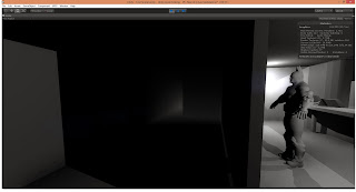
The creepy dark stairway
Around The Death Lingering CORNER!!!


Wow, that looks pretty good! Now we just have to refill it with the finished assets. I guess we have to start thinking carefully on where the monster is going to patrol and if it see's you, how will you get away from it?
ReplyDeleteyea man! I agree with David. This is really good! and you increased the height of the roof :). The creepy stairway looks insane I like the mood that it creates. We need to be careful when texturing, we should try to retain the mood that you have captured here.
ReplyDelete