Wednesday, 27 November 2013

Sink

This is a model of a sink for the toilets in the reception level. I made this model using 3dsMax. This model is inspierd by one of the pictures on the mood board posted earlier on. I don't know if this asset will work with the other asstets so I'll have to wait and see what hapens. It coud be that I might have to do another model if this one doesn't satsfy the group.


This asset was quick and easy to model but the problem that I find with this is that it deosn't show enough detail. It might look better once the texturing is aplied to the model.

Texturing 25th - 30th


Today I have managed to texture the conveyor belts and hook. They are exported out seperately as 3 different object so they can be re-adjusted in unity. I will next add bump and specular maps to the assets, and continue to texture the other asset for the room.

 
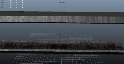
This is a shot of both the conveyor belts with a bump and specular maps. The bump highlights detail whilst the specular highlights light. They have been used together to give off a metal shine but also to show that they have a little wear and tear in them. The bottom shows a dried blood that has been left at the bottom and rust in the metal where is has started to decay.
 
 
This is the turbine fully textured and ready to be put into the game, it has a diffuse, bump, and specular map. I have used rust textures to make it look a little out and outdated whilst a complicated piping texture to exaggerate the high-tech style in which it is built. This is used to power machines around the facility and possibly to grind bodies.


Tuesday, 26 November 2013

Urinal

This is a model of a Urinal that I have made using 3dsMax. This is just a very quick model I wiped up for the toilets in the reception level. This is just your traditional Urinal that are seen pretty much all over the world. 


I didn't have any problems while I was modeling this asset. I will eventually go back to this and neaten it up a bit and try to add more detail but for now this will do.

Toilet

This is the first asset that I have finished for the men's and women's toilets using 3dsMax. This model toilet is similar to one of the pictures from the mood board I posted up earlier. I wanted something different compared to the traditional style.


I never modeled a toilet before so it took longer to make than I anticipated. The part that took the longest was the toilet seat itself because of the shape. Hopefully I won't have to go back to this but who knows.

THE NEW....RECEPTION!!!!!!!

So I was Told that my level had no flow, it was all over the place, so I've massively redesigned it, it's now bigger, more organised, and well structured.


The Main Overview

The first thing the player will see in this section is the laboratory entrance on the opposite, therefore allowing the player to know exactly where they need to go, however when they get there, it will be locked, therefore forcing them to explore and find a key. when they reach the door, it will spawn the patrolling ai, the player will be warned that something is approaching and that they should hide in the cupboard behind them against the wall in the sitting area.


Toilets hallway

The Toilets

Reception area

Staff Area

Reception different angle

Into the labs
Down into the depths

The creepy dark stairway

Around The Death Lingering CORNER!!!


Monday, 25 November 2013

Assets for the Processing Room


These are both assets for the processing room, that were created last week. This week however I shall be texturing and adding more assets to put together for the processing room. Here I have modelled a turbine that powers the machine and the processing machine. I have also created a conveyor belt with the hook that holds humans and pulls them across the room.
 

Sunday, 24 November 2013

Re-Design & Figuring out things in ZBrush

I decided to re-design Monster Character 2 in order to come up of some kind of a varied monster, and in order to experiment with it. I will be going back to the original design and completing that soon.

So here is the re-design that I have being working on this week - it is incomplete.


This week I have also being trying to learn how to retopologize and poly paint in ZBrush and trying to see if I can do everything within the same program; I have also being experimenting and trying to learn ZBrush to see if I can transfer all the details from the high poly to the low poly. Since I do not know Zbrush that well everything is trial and error and I am trying to catch the errors as soon as possible so I can resolve it and move forward.

Retopology from high poly to low poly.


High poly model with a lot of detail and poly-paint. Trying to see if I can transfer texture into the low poly model.


Below you can see the retopologized model with details and poly-paint projected from the high poly model. This low poly model has 19110 tris and as you can see I have lost almost all the details the high poly model has. I need to figure out how to keep most of the details from the high poly on the low poly.


Wednesday, 20 November 2013

Basic Layout

So we've decided to scale down the map. By doing so we're going to focus on three main rooms that will be accessible to the player (Cage Room, Larbratory and the Processing Room) and one room that the player will be able to look in to (the Disposal Room).


This way, we feel we will not be taking on too much work and we will be able to do these rooms to a high standard that gets the message of our game across sufficiently. This is just a basic graybox view of what it will look like, we shall start adding assests from now on.

Tuesday, 19 November 2013

This week

Concept Art:


Paintover of battery egg cages to show a possible cage room concept. I added the rough figures based on the amount of space chickens get to show the cages as cramped and unpleasant and to reflect reality better. I included the escaped figure to give a sense of how tall this would be in engine.  


Assets:

Maya model of the cooker from Joe's processing room concept.Since posting this I have sorted out the issue with the 12 sided face using connect components.

What I'll be doing...

My job for up coming few days is to refine the graybox we have, adjust the layout of where we want things, ultimately scale it down to only a few rooms, so that we can just focus on specific areas, and move forward from there. I will be carrying on with implementing sounds, some will only play in specific zones, and then I can see if I need to make any amendments here and there.

Look at:

flickering lights - code.

ambient sounds

screams

To do

To Do:

Concepts for processing and cage room (Toop)
Assets needed:
Humans - High poly and low poly models - Edit default mudbox human
Arm holding orb (High poly)
Cages
Conveyor belt
Preparation machinery (processing room)
 Tables
 Tanks
 Lab equipment
Meat hooks 
Textures for all assets, ideally two for humans though a lot of farm animals are clones so if they all look the same it might actually be more accurate to what we are trying to portray.

Men and Women's Toilet Mood Board

This hear is a mood board for the men and women's toilets in the reception area. All of these pictures are from the internet and what I wanted to find was something different as in the looks of the object, something you don't see every day. I think I might have found some in these pictures such as the sink in the middle right if the mood board.


I will use these images as inspiration while modeling the assets. 

Monday, 18 November 2013

Processing Room

 
This is a concept of some of the items to be used in the processing room such as; gears, cogs, pistons etc. I have also included images of animals such as cooked pigs and raw cows, to help me to design the colour and texture of the human bodies. I also included some war images of burnt bodies as part of the research. I chose pigs because they are the same colour flesh and meat as human so this will closely help me to design it. I like the cow image because it shows a very interesting way to hang up heavy pieces of meat, very raw colours and just hung there on hooks.


This is the environment concept that I produced for the processing room. I decided to go with a very simple layout showing a convayer belt that pulls humans around the room, into the cooker and then away to be eaten. The layout of the room isn't very accesable although viewing the process of what happens to humans should be horrific for the player to witness. Ive also included some concepts of the vents and machinery as well as some close ups of a pully system and a burnt human.

Item Concepts

So my task for over the weekend was to look at specific items that you would maybe find within a slaughter house, that we could use for our processing room. I started off with drawing three types of hooks that you would hang the bodies up on. I then moved on to hands restrained by cuffs, hung up in the air. I thought that maybe we could combine the two elements.


I was thinking of also looking at the pulley systems/ conveyor belts that would be used to move the bodies along. As well as this I was thinking of also studying the clothing worn by the people who work within those sorts of environments, for example wellies and gloves. Furthermore I will try and produce studies of instruments they may use within the slaughter process (which is going to be terribly gruesome to research!). 


Saturday, 16 November 2013

Weekend Plan

We need to have a proper discussion before we can move forward (Monday 11.30). Untill then tasks for the weekend are:


Toop: I will be sketching environment concepts for the cage area and processing plant.


Joe: Research factory farming, look through the research already posted on the blog and do some independent research and make a post on the blog. Its extremely vital that you do this, will make things a lot easier on yourself once you get this done.


Alice: Concepts for objects in the environment

Thursday, 14 November 2013

Chosen Monster Concepts

These are the monster concepts I and my team have chosen to put in our game. I am posting them here for clarification purposes. The next step is to take these concepts and continue createing 3D versions of them in ZBrush.


Main Character Concept - Improvment


After hearing Eawn's suggestions and opinions on how to make realistic characters and environments as well as my team's, I have quickly decided to improve this main character concept which was chosen by my team. I have used textures to add that little bit of realism. This is how it turned out - I could spend a few more hours on it improving the lighting and the face, but I think this is enough for now as it gets the main idea across.


Tuesday, 12 November 2013

Possible Idea


We looked at a interactive virtual scene of a battery hen farm and came up with an alternative idea. Instead of having the cages arranged in a maze like pattern we could have them arranged in a way more typical of factory farms which would draw more parallels to factory farms.


Link to interative scene:
http://www.animalvisuals.org/projects/empathy/virtualbatterycage/#reference

Reception Progress

Here I have shown the use of bloom/lens flares and anti-aliasing the make our game look visually stunning I have also found the use of deffered lighting in unity to allow the use of dynamic shadows with all lights like the spot and point instead of only the directional light. I am currently experimenting with various visual affects to set the right tone in our game such as motion blur, sun shafts, and many more.


AI lessons with Alistair

So far with Alistair's help we have fully working AI that travels to the way points that the specific bear has attached to it. We have also learnt how to manage Mechanim in unity alongside creating a nav-mesh and giving our AI the nav-mesh-agent.


Each bear has an AI-Patrol script attached to it from Alistair, if the way point index script is attached to cubes in the way points manager which is attached to the bear, the bear will head to these way points. The AI patrol script finds the way points assigned to it and then moves to the next one in rotation.

Player Light Script

using UnityEngine;
using System.Collections;

public class PlayerLightLerp : MonoBehaviour
{
    public float smooth;

public bool lightOn = false;

public int particleTime;

    public bool timerExpired = false;
 
private float newIntensity;

public bool timerStarted = false;

public int lightTimer = 0;

public float cooldownPeriod = 0f;

public CharacterParticle scriptForParticles;

public CharacterParticle scriptForParticles2;


    void OnGUI() {
        GUI.HorizontalSlider(new Rect(25, 25, 100, 30), lightTimer, 0.0F, 10.0F);

    }


// same as if( timerStarted == false)

IEnumerator PollTimer()
{
if(!timerStarted)
{
StopCoroutine("CountUp");
timerStarted = true;

timerExpired = false;

bool stopTimer = false;

while (!stopTimer)
{

if(lightOn)
{
lightTimer--;

if(lightTimer <= 0)
{
stopTimer = true;
}

}
else
{
lightTimer++;

if(lightTimer >= 10)
{
stopTimer = true;
}
}


yield return new WaitForSeconds (1);
}

//yield return new WaitForSeconds(lightTimer);


timerExpired = true;

timerStarted = false;
}

}

IEnumerator CountUp()
{
while( lightTimer < 10 )
{
lightTimer++;
yield return new WaitForSeconds (1);
}
}


void Awake ()
    {
particleTime = 10;
       
        newIntensity = light.intensity;
       
    }
   
   
    void Update ()
    {
       

IntensityChanging();


        if(Input.GetKeyDown(KeyCode.F))
{
lightOn = !lightOn;

}

       
    }


    void IntensityChanging ()
    {
        float intensityA = 0.0f;
        float intensityB = 1.0f;


if ((lightOn == true) && (cooldownPeriod < Time.time ))
{
newIntensity = intensityB;

cooldownPeriod = Time.time+ 10;

scriptForParticles.EnableParticles (true);
scriptForParticles2.EnableParticles (true);

if(!timerStarted)
{
lightTimer = 10;
StartCoroutine (PollTimer());

}

}

if(timerExpired)
{
timerExpired = false;
lightOn = false;
scriptForParticles.EnableParticles (false);
scriptForParticles2.EnableParticles (false);

StartCoroutine( "CountUp" );
}

if (lightOn == false)
{
newIntensity = intensityA;
scriptForParticles.EnableParticles (false);
scriptForParticles2.EnableParticles (false);
}


       light.intensity = Mathf.Lerp(light.intensity, newIntensity, smooth * Time.deltaTime);
    }


}

This is the C# script that changes the intensity of the players light with a toggle button. A cool down has also been built into the script stopping the player using it forever and without waiting for a few seconds.


As you can see the playerlight script has been assigned to the player light in the graphic of the first person controller

Sprint and Crouch

var walkSpeed: float = 7;
var crchSpeed: float = 3;
var runSpeed: float = 20;

private var chMotor: CharacterMotor;
private var ch: CharacterController;
private var tr: Transform;
private var height: float; // initial height

function Start(){
  chMotor = GetComponent(CharacterMotor);
  tr = transform;
  ch = GetComponent(CharacterController);
  height = ch.height;
 
  }
 
  function Update(){
 
  var h = height;
  var speed = walkSpeed;
  if (ch.isGrounded && Input.GetKey("left shift") || Input.GetKey("right shift")){
  speed = runSpeed;
 
  }
  if (Input.GetKey("c")){ // press C to crouch
  h = 0.3 * height;
  speed = crchSpeed; // slow down when crouching
 
  }
  chMotor.movement.maxForwardSpeed = speed; // set max speed
  var lastHeight = ch.height; // crouch/stand up smoothly
  ch.height = Mathf.Lerp(ch.height, h, 5*Time.deltaTime);
  tr.position.y += (ch.height-lastHeight)/2; // fix vertical position
 
}


This is the sprint and crouch script that I found and used, once applied to the first person controller you can edit the walk speed, crouch speed and run speed.
One problem I face is getting the headbob of the character the change when the players speed changes.

Labs Basic greybox


I used the map I created to Greybox the lab. What I have done is made sure that not all the walls are thick but 1 sided. the player won't see one sided walls as they are faced towards the player, thus saving polygons.

My only problem is that I feel the labs should maybe be more maze like forcing the player to get lost in game, where he could unexpectedly be faced with a monster in the dark. The labs then, are subject to change.

Teleport Script for hiding

using UnityEngine;
using System.Collections;

public class EnterWardrobeScript : MonoBehaviour {

// define insidewardrobe

public bool insideWardrobe = false;

//define outsidewardrobe
public bool outsideWardrobe = true;

public Transform destination;

public Vector3 thePositionToMoveTo;

public Vector3 playerPositionInside;
public Vector3 playerPositionOutisde;
public GameObject Teleporter;

public KeyCode key;

public bool inTeleporter = false;
public GameObject objectToTeleport = null;

void OnTriggerEnter(Collider hitObject )
{
Debug.Log("triggers happened: "+hitObject.gameObject.tag);
 
if( hitObject.gameObject.tag == "Player" )
{
objectToTeleport = hitObject.gameObject;
        inTeleporter = true;
}

}


// Use this for initialization
void Start () {

//playerPositionOutside = Vector3;
//playerPositionInside = Vector3(-0.003018092, 0.235682, -0.1295382);

}

// Update is called once per frame
void Update () {


//if (playerPositionOutisde = Vector3(0, 0, 0) && (Input.GetKeyDown("E")))

//playerPositionInside;


if( Input.GetKey(key) && inTeleporter )
{
inTeleporter = false;
if( objectToTeleport != null )
{
        objectToTeleport.transform.position = destination.position;
}
Debug.Log("e is pressed");
}


}
}


This is the script used to enter and exit the wardrobe using empty gameobjects as teleporters.

There are the teleporters of in and out that this script is assigned to

and the teleporter destination that you assign to the script in the ui of unity.


Unity Player light with Particle


I have successfully created the particles that I wanted when the player uses his ability. The problem I ran into is getting it to stay in front of all the walls, I will have to solve this later. What I like about the particles is that they actually flow in real time towards the direction the player is moving which is really cool.

Reception Greybox Snapshots


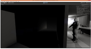
I developed these GreyBoxes after the reception map for Yodahie to do a paintover. I feel that some areas should have been more lit so he could fully see the structure of the room. However, I am happy with the Man that I placed there as it defines the scale around him