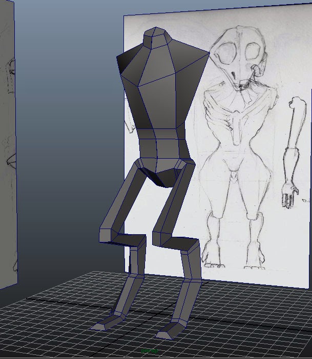
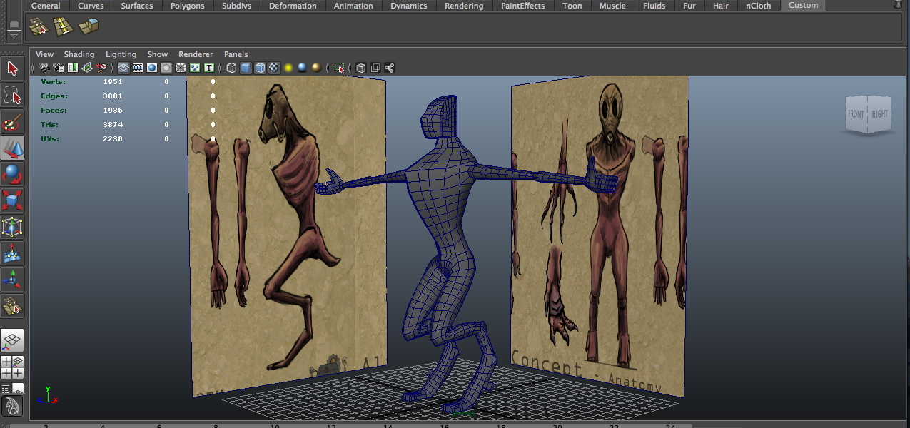
I started off the alien as a simple basic 3D model blocking in all the major parts such as the leg, torso, and then moved on to getting in the posture to the right position. I then started to add more loops to make the model more even with all the polys, and to also smooth out the character. I started to implement the arm and hand features. I am so far enjoying creating this alien as I am finding it interesting creating a new anatomic structure. I have played around with the posture and have posted it below, not quite sure what to do about it as in if the weight looks central, and I'm questioning the syle on the knee.

For the next part of developing my Alien I need to create a model similar to what it is going to look like so I can put it into Z-Brush. The most important thing for exporting to Z-Brush is that the model is completely even and contains only quads. This is was seeming to be a bit of a problem because the previous model has triangles. I saved the original file and created a new one adjusting the original model by deleting the claws that had lots of detail that was uneven with the rest of the quads. I recreated them in a simple manner that isn't very detailed but its even. I can now bring this into Z-Brush and start sculpting.
I brought the model into Z-Brush and started to play around with form by altering the poly's into a more interesting shape. I changed the shape of the head, as well as bulking out some the chest and the posture.
I started to add detail to the model: I began to add in bone and muscle deformation around the model, and exaggerated its form. I have just been working on form of the muscle and skeletal features at the moment and will start to add detail at a later stage. This is my first time using Z-Brush, it was pretty difficult to get used to but I think I have the hang of navigating around it. I have learnt a few things such as masking and moving selected areas, I found this to be quiet a useful method.
Update: 27.01.14
The past week I studies into more of the anatomy for the alien such as the muscle tone for the legs. I took me a while but I managed to create somewhat of a similar muscle structure to that of a humanoid figure. I had started to work into the arms but unfortunately it started to look unbalanced and out of place; it looked dislocated. I then had to go back and study some arm anatomy.
These are a few of the designs I produced to help towards the arms, chest and shoulder area of the creature. By looking at how the human arm works I was able to produce a similar design for the alien, that help me to look at its functionality, and where its muscles and bones are. I found this very useful as it helped for me to take a closer look into form and structure of how muscles work and therefore to how they could be translated onto an alien body.
These images are what I was able to produce today I started to add muscle deformation to the arms, chest and neck area. Whilst doing this I realised that the arms look a little too big for the creature so I ended up resizing them and rotating them to a position that looks more natural.
Update 28.01.14
I have brought the sculpt into maya as a template to help me design the mask of the creature. I have done this so I can produce a nice hard surface object that would suit the style of how I want it to look on the design, also because its a lot easier and faster to produce a quick model of the mask rather than trying it from scratch in Z-Brush.
I started the mask with simple shapes, such as the hard surface parts of the mask so to give me indications as to were certain parts are. I then started to map out areas around the mask using a plane and extruding the edges to help create a base flow of the model. I produced this in parts through the top and round the side, and linking them in the middle.
After all the main parts were added in I started to link all the polys together and keeping in mind that I have to keep the flow even. I managed to get to a point in which most of the mask is done I just need to fill in areas, and add in extra details such as the breathing parts.
Update 17.02.14
The past two weeks prior to this post I spent finishing off my dissertation hence the big gap between dates. I continued with this model on the 10th of Feb, So this is a post relating to a weeks work.
I started off by finishing the mask, its a very rough model as it was just to be used as a separate base mesh in Z-Brush. When importing the object I forgot about the pipe being attached to the model, that got in the way of the mask so unfortunately I had to restart sculpting the mask, on a separate model. I began to sculpt all the details in and added in the folds from where the pipe met the mask.
These are the final renders of the high poly model, I also went up a sub-division and added more detail into the chest and back area. I found this method at the end quite a useful way to incorporate the final details. The next step was to bring the model into Maya and create a game mesh over the top of it.
Using Maya 2014's new typology tools, helped me to easily create a model over the top of the high-poly mesh. I found a function that allowed me to draw poly's over the top of a selected mesh. I focused the poly count mostly on getting the flow of the model to work well when I animate it, and then at the end I added extra loops to keep it as square as possible. The new function allows you to draw dots and then produce a poly on top, as well as making sure it sits on top of the chosen base mesh. I was also able to create edge-loops that would form around the mesh which created a very efficient way of modelling forms accurately to the high poly.
Images above: show the difference between the high poly mesh and the re-created low poly one underneath.
I learnt how to re-create the head in a way so that there was more detail on the head and it didn't interrupt the rest of the typology around the body. I added in extra poly's around the areas that will animate and move the most.
The images above show the typology around the arm, and shoulder and how it flows around where it would bend. This helps for when the character animates so that it wont stretch the texturing. The green light shows the flow of the poly's that go around the arm, it also helps when adding in more polygons to the model.
This image shows the poly's around the hand and how I used tri's to help the hand bend in the directions of the animations, creating pinches in certain areas.
Update 19.02.14
I have been messing around with High to Low poly baking, using a combination of Maya, zBrush and MudBox for the process.
The top image is a screenshot of the low poly (retypologized model) which using the high poly mesh I made in Z-Brush I altered it to fit over the model. I unwrapped the model in Z-Brush, and created a set UV Map. The bottom image shows the high poly model in Z-Brush, from which I can extract the detail from, and below is a test render of the two combined, having the low poly model with the detail from the high poly model. It seems to work very effectively, however I have made a few mistakes in the sense that I needed to change the form of the high poly model as the arms are not completely in a T-Pose like the low poly one is. Also the UV map had to be altered which had several problems in which I will fix for the final render.
Update 28.02.14
This is an update of what I have been doing this week. I started off by finishing baking the Alien into its low poly form, I tested it in Unity with how the lighting effects the creature. The high poly map seems to show up really well around the low poly model. I then re-baked the models to a higher resolution and started to create the diffuse map in Photoshop.
Skinning and Animating -
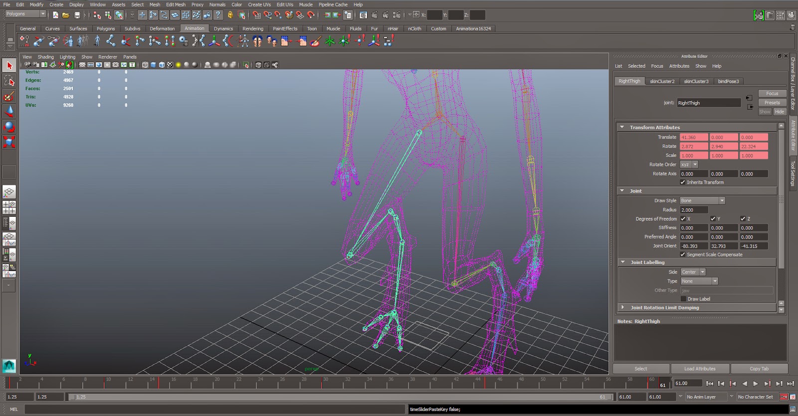
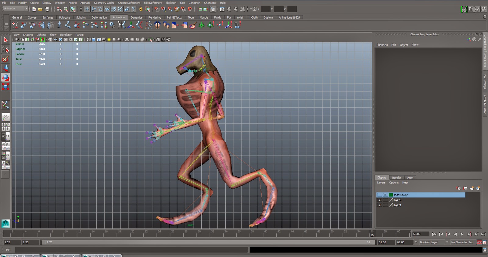
This process is started by creating the bones for creature, making sure that the joints are all in the right place to where the characters joints are. By using a double joint, I am able to create realistic muscle deformation, and better ways to bend certain areas of the body.
I used an extra bone to secure the rib cage (area) so that it won't twist along with the motion of the body. I did this because it is an almost exo-skeleton and will not move much. The image below shows the result as of when I started to add weights to the bones.
Most of the character is skinned but some extra areas need to be adjusted so that the motion works well. As you can see in this model the texture needs to be altered still slightly, the texturing isn't completed but is at a stage in which I can see where I am currently at when the character is being animated. This slight indication can help me when painting around the seems and seeing how the texture stretches.
Update 07.03.14 - Continuing skinning
I have been fairly busy this week so have only really spent a few extra days on skinning, and the rest on designing other characters for our game.
I have managed to fully create the skeletal structure for the alien, including enabling movement in the pipe on its head. As I was adjusting the weights around the top of the body I must of pressed a button that screwed up the weights for certain areas of the body. See below:
One of the things that may of done this is when I have been using the 'Mirror Skin Weights' function. I have been using this tool as it makes the whole process a lot easier and faster, it basically copies the skin weights from one side of the body to the other. One problem with this is that if the body isn't in the same pose all over, the weights will go a bit funny on the mirrored side (in this case I'm working on the left side and copying to the right). When doing skinning tests I must of not had the character in a bind pose, and as a result removed the influences from some of the bones. Luckily it was only in the fingers and toes that were massively affected.
For the pipe, I used a a locator that joined the two ends of the bones to the middle in which I can move to give the pipe subtle movements when the character moves.
I also looked into 'Falling Skies' and how the mecha moves in relation to shifting its body around, and how its joints move, similar to how the Alien does. Using these studies I shall mimic the animation in a similar way to suit the Alien's walk cycle. I found how the mecha moves quite an expressive form of shifting such a heavy weight around, and how its extra joints help support the movement.
Update 14.03.14
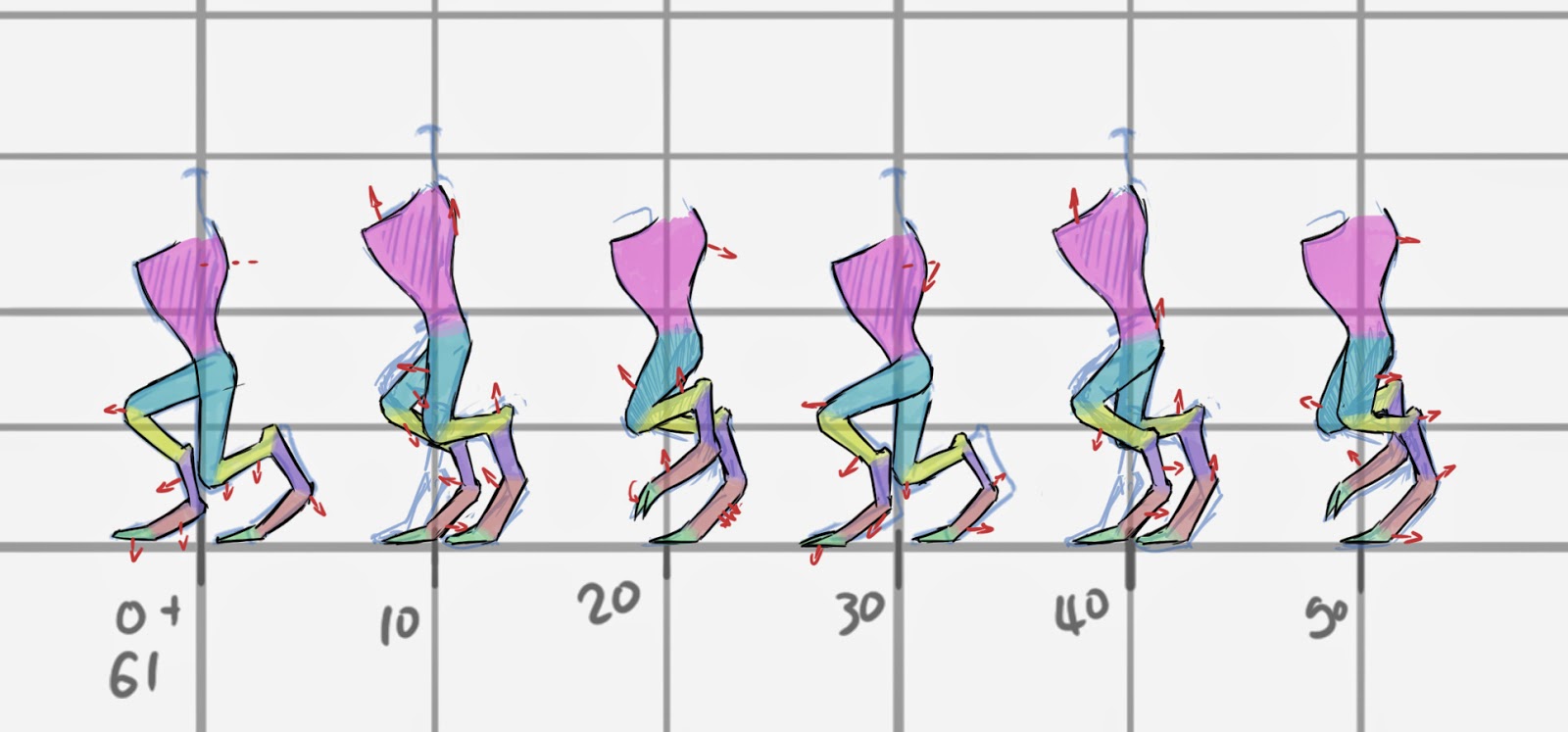
I managed to alter the alien's previous walk this week to an ok-ish walk cycle. I may return back to this at a later stage but for now I need to move onto other things in the project. But so far I have made a forcefully-stepped walk cycle and also have added a slight bob in the animation. I found this phase pretty tricky as I'm not to confident with animation, however it will look different when its played in a game. I produced some sketches to further expand on exactly how the key frames will run out.
This is the sketch I did to understand the movement within the legs and how it would form as a movement in relation to the key frames. I also produced this to guide me to create a smooth flowing animation.
I even added in a bob in the piping attached to its mask so that it looks more realistic. (The alien's texture is still needed to be changed)
Update 21.03.14
The animation has proven to be needed to be adjusted, as it doesn't look like it is walking along the floor. Many things were wrong with the previous animation such as: the looping of the animation looked a bit laggy, the flow of how the body moved looked un-natural, and overall it didn't look like a walk, as in the creature didn't have much of a bob in its walk. One of the problems (being the lag in when it loops) can be sorted by making frame 01 and 61 the same position for the character. I was originally working on 30fps but the walk takes 60 frames for a fully completed walk. The problem was that there were two frames that played the same animation, so to fix this, by making frame 61 the same as 01, the movement of the character will look more free-flow when it goes from 60-01 in the loop.

I decided to started on a run for the character, as the walk was irritating me and didn't seem like it was getting anywhere. By using a chicken's run animation, I managed to mimic the movement onto the alien creature I had produced. I drew over the animation in photoshop so I could easily figure out the movement in each of its bones through each frame. Through the study of this animation I figured out that the chicken animation was at 24fps (frames per second), and my animation was at 30fps. To get around this I took every 4th frame from the chicken animation which gave me 6 frames for the loop and applied it to my animation which worked out to be a new frame every 5th frame.
The animation seems to work much better in unity, with only a few small problems, which I will get back to on later. I found this technique much more effective as it has the sense of realism in the flow of its movement.
Update 27.03.14
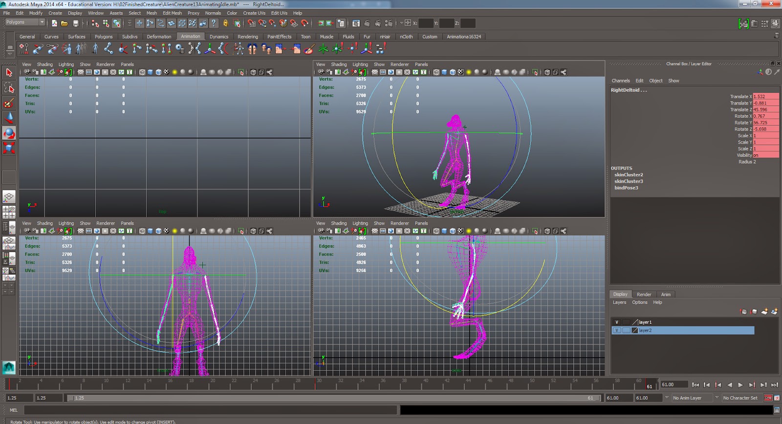
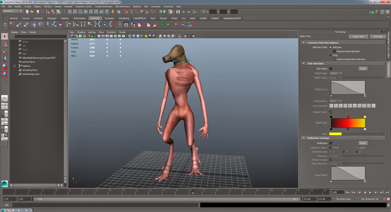
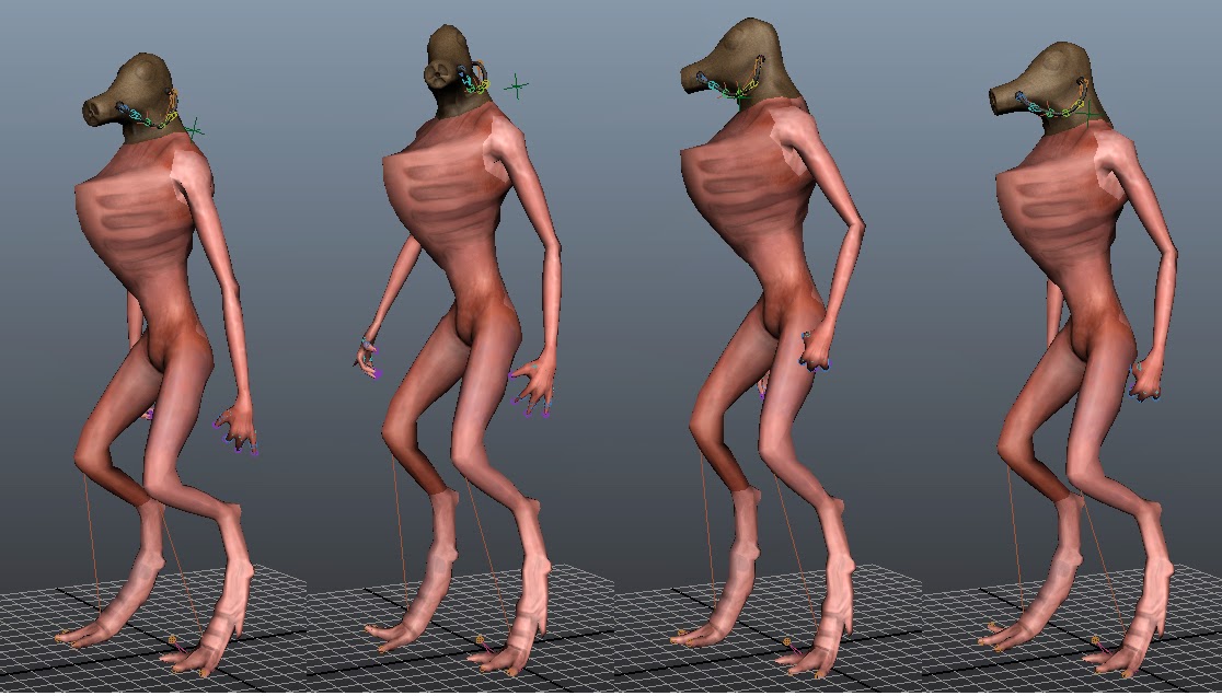
Alien Idle Animation: Having to create an idle animation for our alien character I decided to chose an animation of it having a look around at the area to see if anything looks suspicious. Idle animations are a lot easier than walk cycles, so I decided to give the walk/run cycles a rest for a bit to allow me to process some other pieces for our game.


After the first two attempts me and Michael decided that the animations needed to be further improved, thus in doing so I re-animated once more. The problems with the previous animation was that the feet weren't securely on the ground, so with the use of a IK Handle Tool I was able to create a connection from the knee to the feet to make sure they don't move from the ground. In doing this I found out that all I had to do (for the leg animation) was to lift the hip joint up and down, and the handle joint would do the rest. Such a fantastic tool, I think I'm going to see how it may help me with future animations such as walk cycles to make them more fluent. The other problem I had was it looked too robotic, so I added in extra subtle movements with parts of the alien's body in the arms and re-positioned the chest so that it leant forward and not back.

Alien Texturing: I also had to adjust the texture so that you wouldn't see the seems, for this I just made sure that the same variation of tone and colour was around the outside of the UV pattern. I found using a darker colour was a lot more effective.
These are some tests of different texture colours I can use for the character, I think these are nice tests so we can see what would look best for the alien in the game. I corrected most of the seems, and made extra detailed areas more noticeable. The texturing still needs to be improved more.
Update 04.04.14
This week I have been adjusting more things with our alien-enemy, One of the edits was the texturing, I have added extra detail to the model but will be updated when the texture is more noticeable that there is a change. I have also adjusted the run so that it looked more fluent with the arms so that they move with the body, however more edits are still needing to be made.

As previously explained - the walk cycle is needed to be adjusted, so to make this easier for myself I created a 2D walk cycle of the animation, from which I could copy from. The reason why I drew this out first was so that I could adjust it easier in a 2D view port. I also found it a very good indication for how the muscles and body would move, and helped me when deciding what happens on each frame. With the animation itself I used 'IK Handles', which again have been proven to be a massive help, especially for when creating a fluid motion in its movement, and makes the whole job a lot faster. The shot below shows how the run currently looks, however I am going to have to adjust the movement of the rest of the body.


Update 07.04.14
Today I spent the whole day fixing up the walk animation, I spent a good part of it researching some tips on Digital Tutors. After taking in consideration of the tutorials I started to give the creature some body sway in its movement. The tutorial spoke mainly of altering movement in the graph editor to make it look more fluid and flowing.
I started by giving the arms a bit of swing which I had to adjust to make it look more fluent, then moved onto the chest/neck area. It was a lot easier to animate as of the IK handle connecting the head to the chest, which gave it a smooth appearance. The animation looks a lot better than what it used to look like, it now looks more of a natural movement. Another thing I managed to sort out is how the body shifts its weight in its walk.
Update 11.04.14
This week I worked a little on improving the texture, I spent two days fully focused on adding more detail and helping the character look more like it would be part of our game. I decided to add some more variation to parts of the body such as the feet and chest areas. I wanted to make the chest look as if he has an exo-skeleton that blends in with the body, I made the design look like the bone is coming out from the skin to give it a more creepy look to the alien creature.
Update 03.05.14
Texturing Continued...
D-Do Texturing:
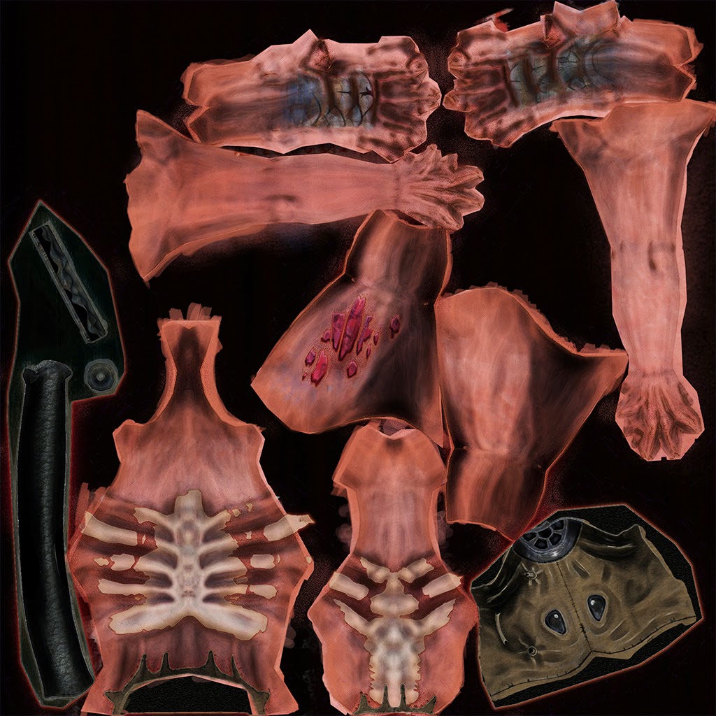
The skin in the alien looks a little cartoony so I decided to keep editing it by using a programme called D-Do. I found this to be a very helpful tool for texturing and the results come out really well. The tools allowed me to add more realistic details to the skin such as adding different colour variations, and freckles etc. Basically to make the skin look more realistic as to its original painty style.
These are renders of the Alien in D-Do's Skyshop renderer I turned off the gloss texture as it seemed to make my character too shiny. I was just testing the Diffuse and not the spec/gloss.
The above image shows the low specular material (left image) and the high gloss (right image). I didn't end up using the gloss but from the images you can tell that it is way too shiny so I took elements from it for only certain areas.
Once I made a fairly detailed texture I exported the Diffuse, Specular, and Normal maps so that they could be pugged into a shader in Unity. I found that the Specular map was too bright and therefore made everything shiny in unity, which wasn’t what I wanted. This especially became a problem with areas such as the leather mask, which shouldn’t be shiny at all. To fix this I selected areas and darkened them, other areas such as its wound and the scaly feet that will look slightly wet, I made lighter to help highlight that effect. The highlights from the specular seem to work especially well when combined with the normals, to pick up the extra details.
The Finished Creature:
This is the finished alien that I created as an enemy that the player must avoid within the game. I had quite a bit of fun texturing this as its not human I was able to be more creative with the effects and details that were added to the model. The Diffuse was based around a specific theme but was enhanced in areas such as cuts and and metallic areas with the help of a specular map. The normals really helped to bring out the alien forms in the foot and the exo skeleton around the chest area.
Much like the other characters, I'm keeping with the idea that the floor is slightly wet and so the alien has a high specular on its feet to emphasise this. The end of its mask really stands out with the contrasts of the shiny metal combined with the none shiny leather mask.
Diffuse (2048x2048)
Normal (2048x2048)
Specular (2048x2048)


